What do Apple, Amazon, Baskin Robbins, and Toblerone have in common? They have hidden messages in their logos—here’s what they are and what they mean.
Did you know these logos have hidden messages?
As consumers, we see company logos daily. If you stop at 7-Eleven, you see its logo as soon as you pull in. If you make a pit stop at Dunkin’ for coffee, you’ll carry its logo on your coffee cup. Logos are everywhere, but have you ever stopped and really looked at them? There’s more to them than meets the eye.
Turns out, many companies have hidden messages in their logos. Companies like Starbucks, Amazon, and even Goodwill strategically designed their logos to convey subtle messages about things like company values and products. Logos can also try to subconsciously influence buying behavior, which partially explains why so many logos are red. Let’s look at the hidden messages in logos you see all the time, and why they’re there in the first place.
Amazon
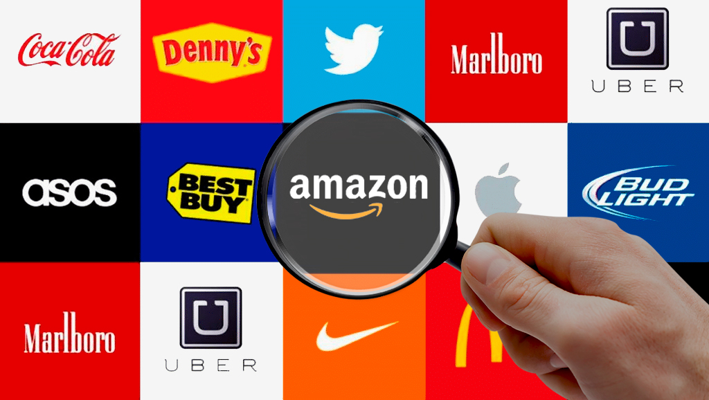
Amazon is a staple in many online shoppers’ lives, but have you ever wondered what that little arrow at the bottom of the logo means? It’s not just a fun design element—the arrow broadcasts the wide variety of stuff (from A to Z) sold on Amazon.
Apple
Why does the tech giant’s iconic logo have a bite mark on it? Turns out, the reason is pretty practical. The designer made the bite mark for scale, so that a smaller logo would still look like an apple and not a cherry.
Toblerone
If you’ve snagged this delicious Swiss chocolate bar in your day, you’ve seen the mountain on its logo. But wait, what’s that on the left side of the mountain? Turns out, it’s a bear. The bear is the official symbol of the Swiss town of Bern, the original home of Toblerone.
Dell
The sideways E in the Dell logo is more than just a creative way to set it apart from other logos. Michael Dell announced that the goal of his company was to “turn the world on its ear.” So it’s been said he started with an E.
Sun Microsystems
The hidden message in this logo is very clever from a marketing and branding perspective. If you turn the logo around, the word “Sun” is always there.
Goodwill
You may assume the logo contains a smiling face to represent how good it feels to clean your house, donate items, and recycle clothes you no longer use. However, the face is actually just a larger version of the g in the word ‘goodwill’ that appears at the bottom of the logo. Who knew?
Tour de France
Does the yellow circle represent the sun? Nope! Turns out, the yellow circle is actually a bicycle wheel. The “R” in “tour” is a person, and the “O” in “tour” is the back bicycle wheel.
Wendy’s
At first glance, the Wendy’s logo looks pretty straightforward—but there is a hidden message in it. Specifically, there’s a secret word hidden in the collar of Wendy’s blouse. Look closely and you will notice the word “Mom” scrolling in the old-fashioned-looking top. Many thought it was a nod to the chain’s efforts to prove a home-cooked feel to their food, but higher-ups at Wendy’s say the secret message was actually unintentional.
LG
Are the L and the G cleverly configured into a smiley face, presumably the face of a happy LG customer? Nope. Eagle-eyed folks point out that if you tilt your head to the side, that smiley face actually looks like a modified version of Pacman. Perhaps an ode to the beloved arcade game character and the earlier days of personal technology? That’s up for speculation. According to LG, the logo stands for the world, future, youth, humanity, and technology.
Hershey’s Kisses
These two overlapping Hershey’s Kisses make us crave chocolate big time. But, if you look carefully at the logo, you’ll notice it doesn’t contain merely two kisses, but three! Look between the K and the I in Kisses and tilt your head towards the left—you’ll see a sideways kiss planted firmly between the two letters.
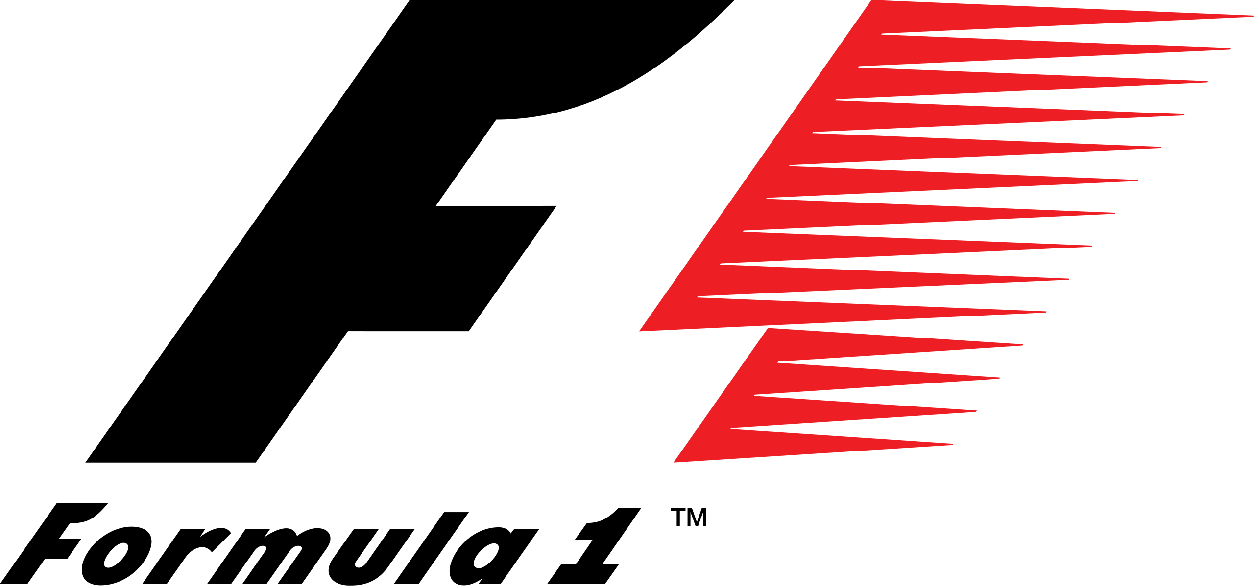
Formula One
With this earlier Formula One logo, you get a strong racing flare with the bold “F” and modern red flame motif, and you may feel the need for speed. But much like how the FedEx logo uses negative space to its advantage, so does Formula One. At first glance, you see the black “F” but if you look in the middle, the “1” in Formula One is clearly present in white.
Roxy
As Quiksilver’s female fashion line, the logo was indeed designed to attract its desired demographic. However, a closer look reveals so much more. The Roxy heart consists of two Quiksilver logos rotated to form the shape.
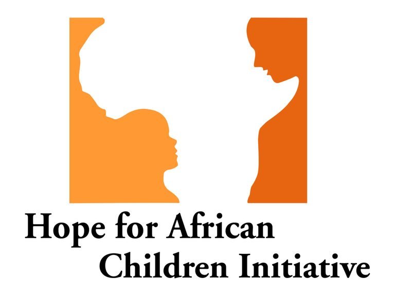
Hope for African Children Initiative
Yes, the logo definitely includes the outline of Africa, but if you look at the orange and yellow sections carefully, they are put there purposefully. In those areas, you’ll identify the silhouettes of a child and an adult.